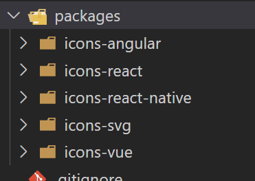
他会单独吧svg抽离出来使用,再分为,三种类型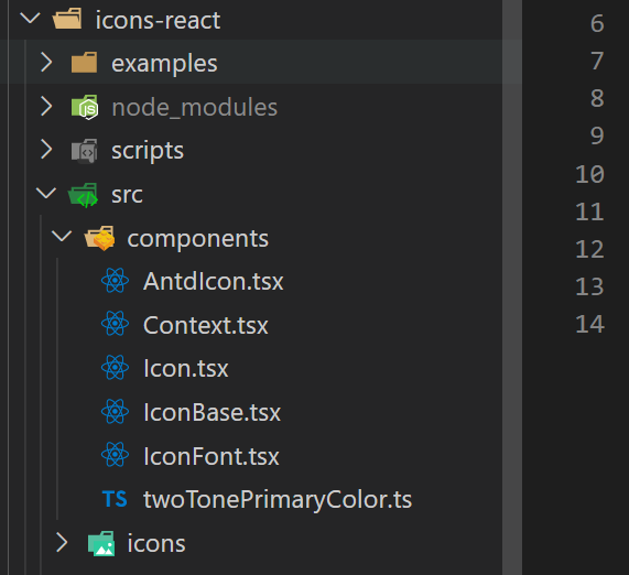 ,而且react等框架都可以使用是如何做到的?,还支持按需导入与智能提示,原理就是
svg 图标的内容就是 xml 语法,将 svg 内容解析成 asn ,即「抽象节点」 (Abstract Node),然后实现能渲染该抽象节点的 React 组件即可
icon-react
看一下icon-react文件夹
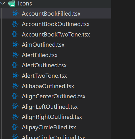
可以看到icons文件下的文件都是自动生成,并且分为三种类型,对应icon-svg下的三种类型,随便查看一个文件
// GENERATE BY ./scripts/generate.ts
// DON NOT EDIT IT MANUALLY

import * as React from 'react'
import AccountBookFilledSvg from '@ant-design/icons-svg/lib/asn/AccountBookFilled';
import AntdIcon, { AntdIconProps } from '../components/AntdIcon';

const AccountBookFilled = (
  props: AntdIconProps,
  ref: React.MutableRefObject<HTMLSpanElement>,
) => <AntdIcon {...props} ref={ref} icon={AccountBookFilledSvg} />;

AccountBookFilled.displayName = 'AccountBookFilled';
export default React.forwardRef<HTMLSpanElement, AntdIconProps>(AccountBookFilled);可以看到AccountBookFilledSvg传入了AntdIcon
// AntdIcon 部分代码如下
const Icon = React.forwardRef<HTMLSpanElement, IconComponentProps>((props, ref) => {
......
  return (
    <span
      role="img"
      aria-label={icon.name}
      {...restProps}
      ref={ref}
      tabIndex={iconTabIndex}
      onClick={onClick}
      className={classString}
    >
      <ReactIcon
        icon={icon}
        primaryColor={primaryColor}
        secondaryColor={secondaryColor}
        style={svgStyle}
      />
    </span>
  );
}) as IconBaseComponent<IconComponentProps>;

Icon.displayName = 'AntdIcon';
Icon.getTwoToneColor = getTwoToneColor;
Icon.setTwoToneColor = setTwoToneColor;

export default Icon;ReactIcon对应的就是iconBase,iconBase的主要功能是动态构建svg组件
// 主要代码如下
export function generate(
  node: AbstractNode,
  key: string,
  rootProps?: { [key: string]: any } | false,
): any {
  if (!rootProps) {
    return React.createElement(
      node.tag,
      { key, ...normalizeAttrs(node.attrs) },
      (node.children || []).map((child, index) => generate(child, `${key}-${node.tag}-${index}`)),
    );
  }
  return React.createElement(
    node.tag,
    {
      key,
      ...normalizeAttrs(node.attrs),
      ...rootProps,
    },
    (node.children || []).map((child, index) => generate(child, `${key}-${node.tag}-${index}`)),
  );
}
其实可以发现刚刚的AccountBookFilledSvg应该是一个对象一样的东西
SVGO
const svg = '<?xml version="1.0" ...>';
const optimizer = new SVGO({
  floatPrecision: 2,
  // 通过 plugins 来对内容进行修改,支持自定义 plugin
  plugins: [],
});
const { data } = await optimizer.optimize(svg);
生成 asn(抽象节点),类似这样
{
  "tag": "svg",
  "attrs": { "viewBox": "0 0 1024 1024", "focusable": "false" },
  "children": [
    {
      "tag": "path",
      "attrs": {
        "d": "..."
      }
    }
  ]
}
最后根据这些抽象节点动态的生成react组件
easy-icons
yarn add easy-icons -D使用easy-icons插件来帮助我们完成这些工作
目录结构
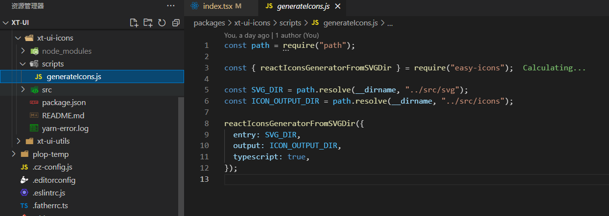
// package.json添加
  "scripts": {
    "icons": "node scripts/generateIcons"
  },
// 执行命令
yarn icons