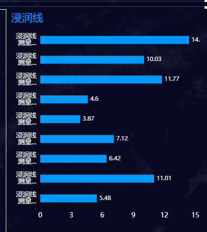
选择不同的内容柱状图 实时变化,这里用到了vuex,echarts
由于项目的模块比较多所以会使用vuex里面的modules,使用过程当中遇到的问题
第一个指的是模块名称,第二个是值,然后在watch里面监听变化,这样是没有问题的,于是我在请求其他列表数据的时候发现取不到值

于是换了下面的一种方式,直接state.模块名,这样就可以顺利的获取了
...mapState({
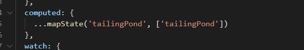
saturationLineInfoList: (state) => state.equipment.saturationLineInfoList
})比如父组件向子组件传值时一般是这么写

但是代码看着很丑,可以直接传一个对象,在此过程中如果嵌套过多可以使用$props,$attrs
- $attrs包含了父作用域中不作为 prop 被识别 (且获取) 的 attribute 绑定 (class 和 style 除外)。
- $props当前组件接收到的 props 对象。
echarts(版本为4)
这是一个柱状图,要实现纵向效果,就把x和y轴的值反过来就行,之前调echarts的大小总觉得大小没占满,可以使用grid,还有一点就是鼠标放在x或者y轴上显示内容怎么做呢,首页在你需要显示的轴上写上triggerEvent:true
initMap (yData, seriesData) {
     const chart = this.$echarts.init(this.$refs.bar)
     chart.setOption({
       tooltip: {
           trigger: 'axis'
       },
       grid: {
           left: '10px',
           right: '10px',
           bottom: '0',
           top: '10px',
           containLabel: true
       },
       xAxis: [
       {
           type: 'value',
           axisTick: {
             show: false,
             alignWithLabel: true
           },
           axisLine: {
               show: false,
               lineStyle: {
                   color: '#fff'
               }
           },
           axisLabel: {
               fontSize: '14'
           },
           splitLine: {
             show: false
           }
       }
   ],
       yAxis: [
         {
           triggerEvent: true,
           data: yData,
           type: 'category',
           axisTick: {
             show: false
           },
           axisLine: {
               show: false,
               lineStyle: {
                   color: '#fff'
               }
           },
           axisLabel: {
           formatter: value => {
             let res = value
             if (res.length > 4) {
               res = res.substring(0, 3) + '\n' + res.substring(3, 5) + '...'
             }
             return res
             },
             interval: 0,
             fontSize: '14'
           },
           splitLine: {
             show: false
           }
       }
   ],
       series: [
       {
           name: '浸润线埋深',
           type: 'bar',
           label: {
             show: true,
             position: 'right',
             textStyle: {
               fontSize: '12',
               color: '#fff'
             }
           },
           barWidth: '40%',
           data: seriesData,
           itemStyle: {
              normal: {
                  color: '#0099FF'
                }
              }
           }
        ]
       })
     this.extension(chart)
   },
然后调用extension方法
// 显示名称
    extension (chart) {
      const dom = document.getElementById('extension')
      if (!dom) {
        const div = document.createElement('div')
        div.id = 'extension'
        div.style.display = 'none'
        document.body.append(div)
      }
      const extension = document.getElementById('extension')
      chart.on('mouseover', (params) => {
        console.log(params)
        if (params.componentType === 'yAxis') {
          extension.style.position = 'absolute'
          extension.style.color = 'white'
          extension.style['font-size'] = '15px'
          extension.style.padding = '5px'
          extension.style.display = 'inline'
          extension.textContent = params.value
          const event = window.event
          const xx = event.pageX - 130
          const yy = event.pageY - 5
          extension.style.top = yy + 'px'
          extension.style.left = xx + 'px'
        }
      })
      chart.on('mouseout', (params) => {
        if (params.componentType === 'yAxis') {
          extension.style.display = 'none'
        }
      })
    },